Brand identity for Samfunnsviterne
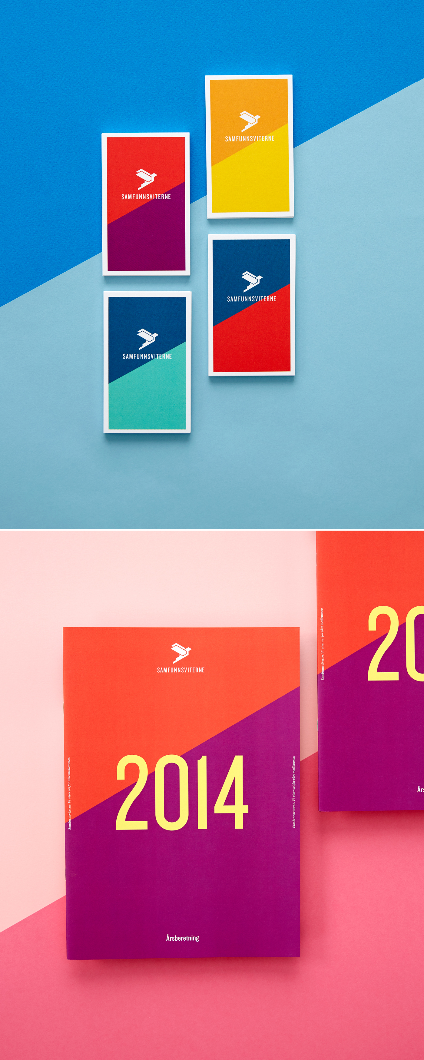
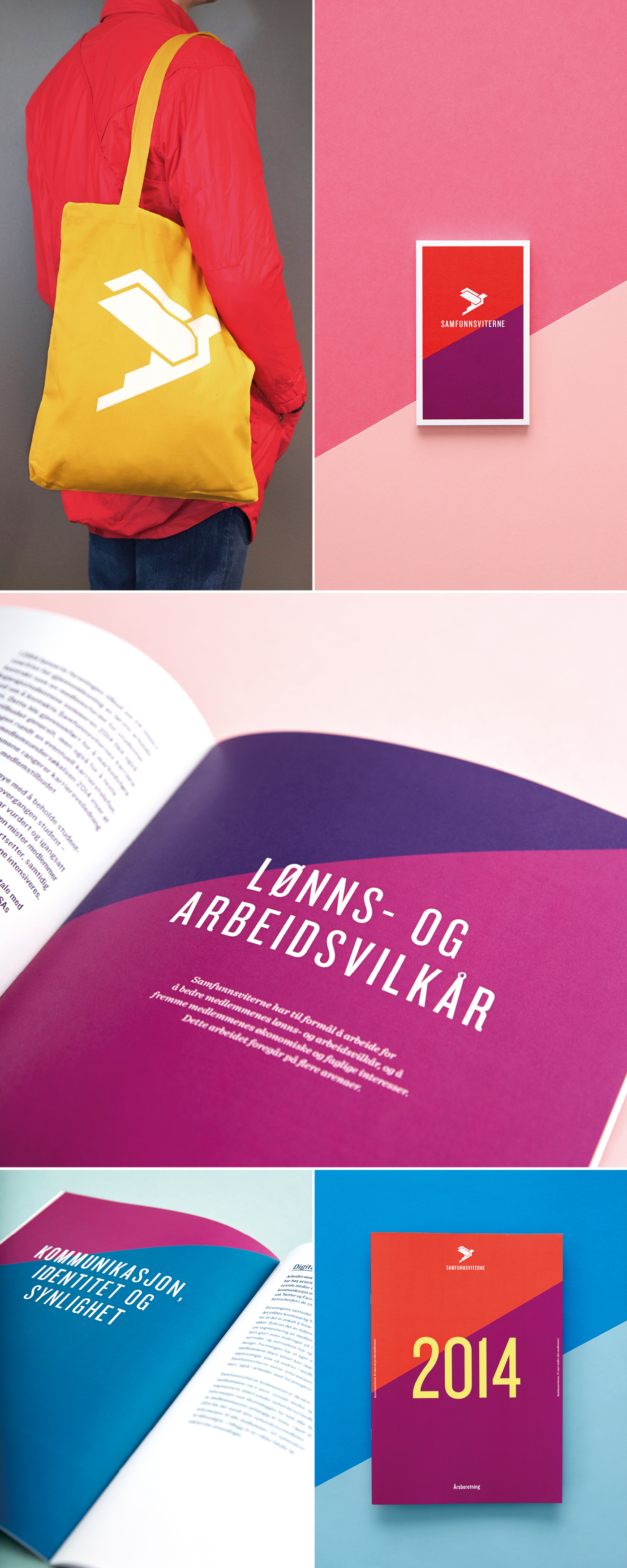
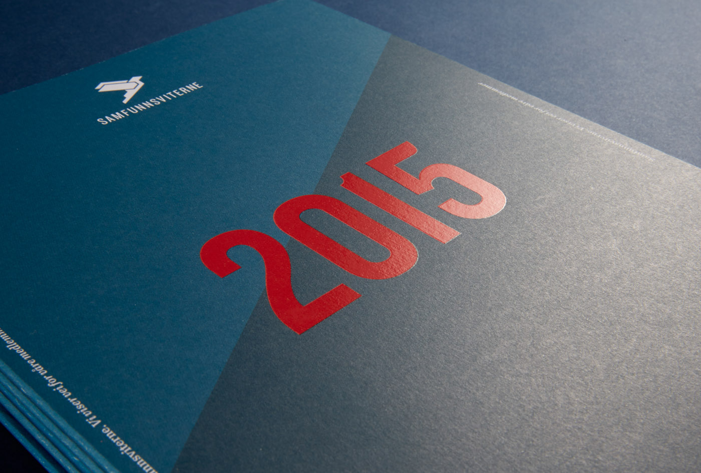
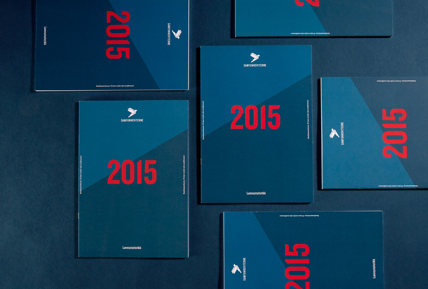
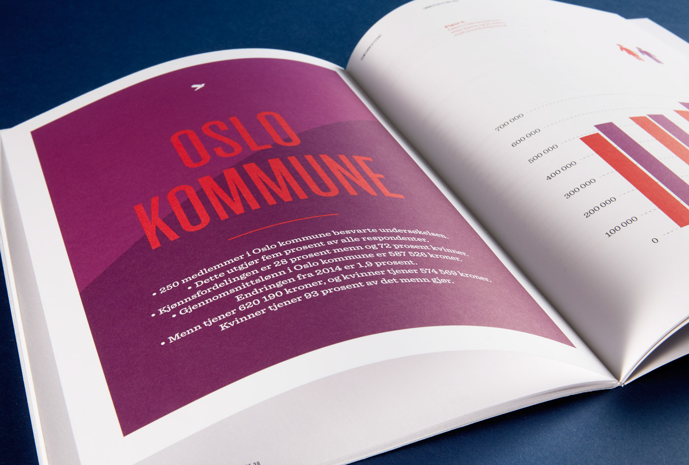
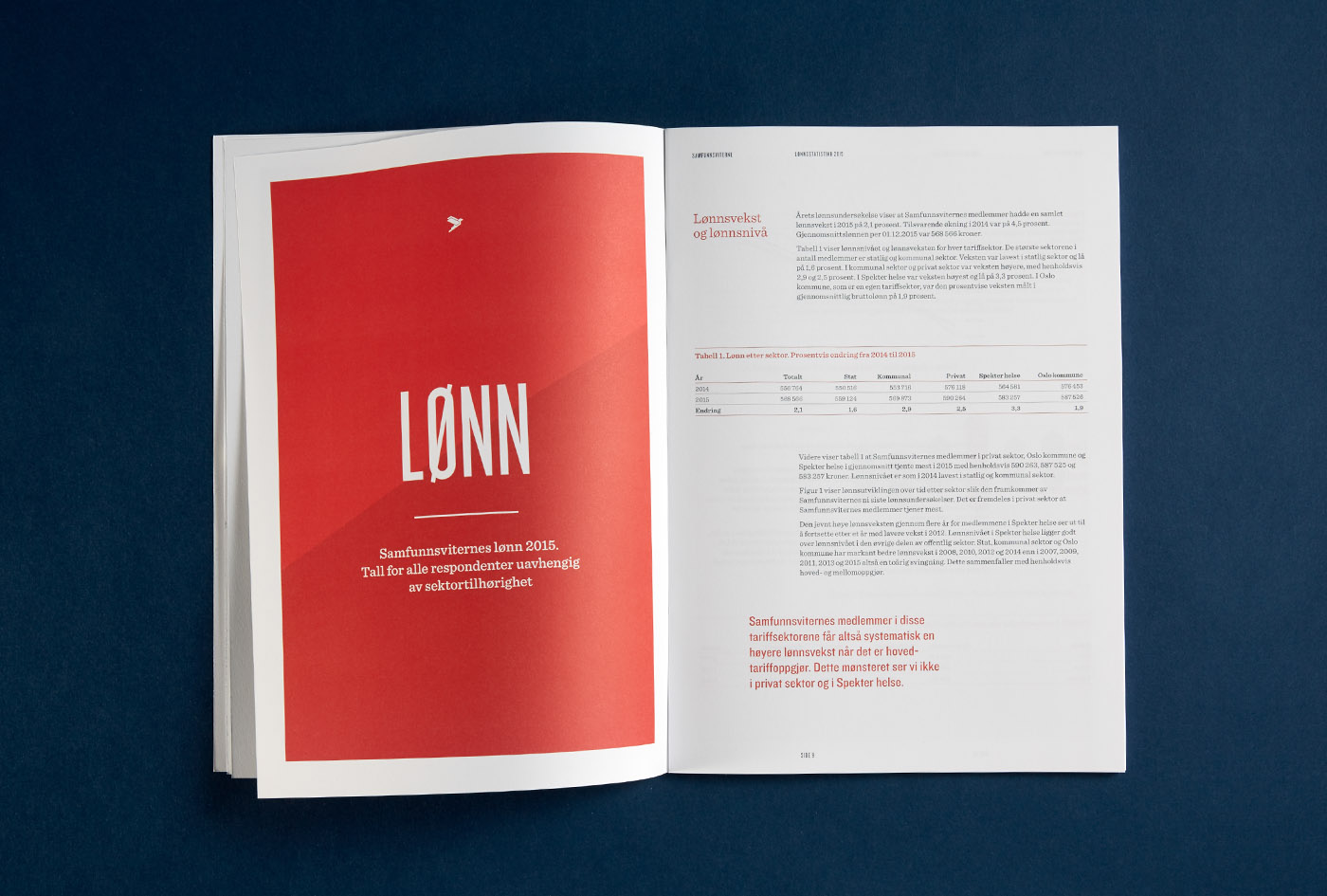
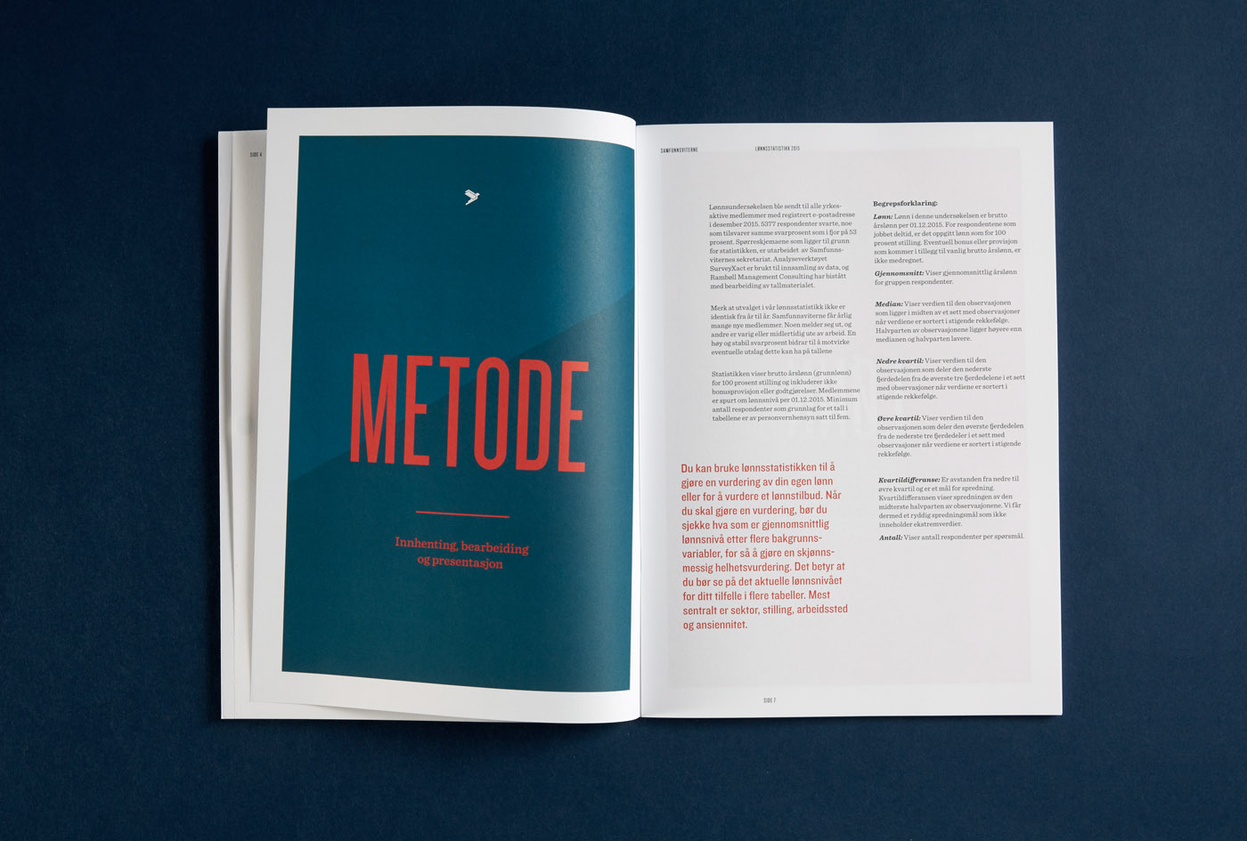
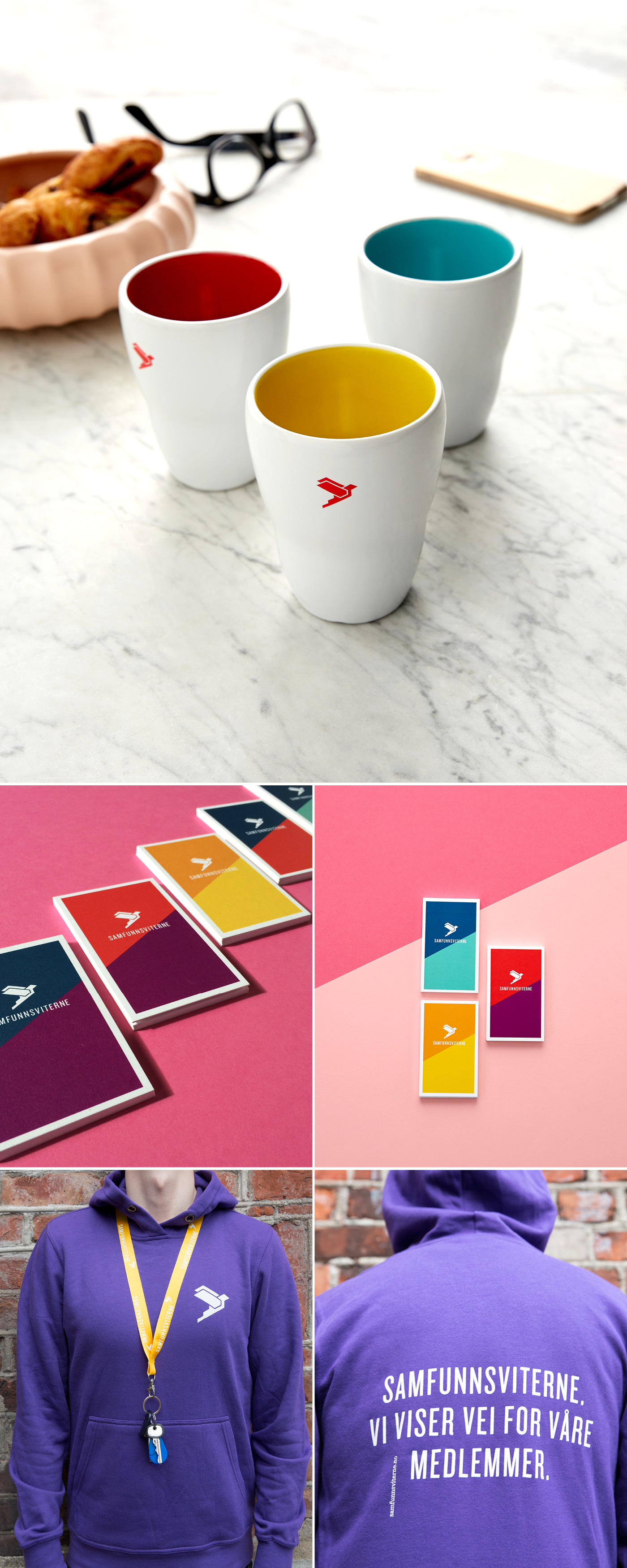
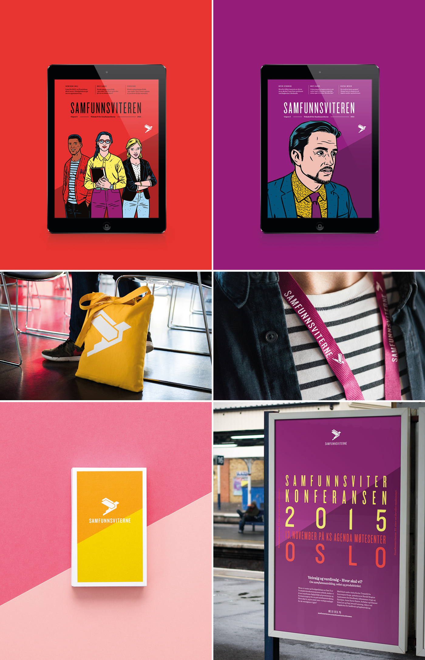
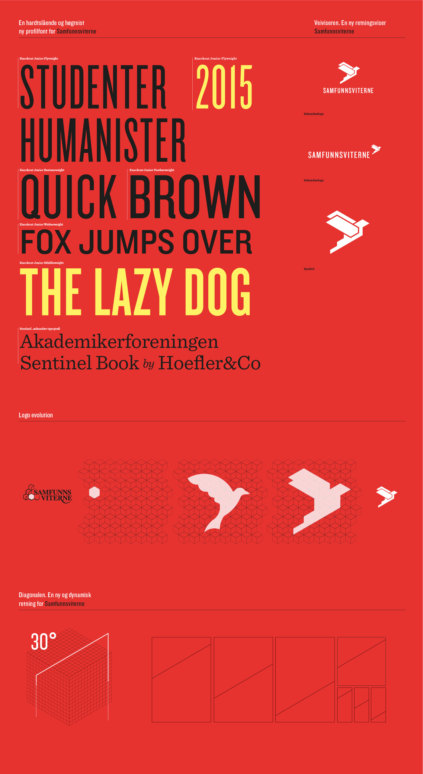
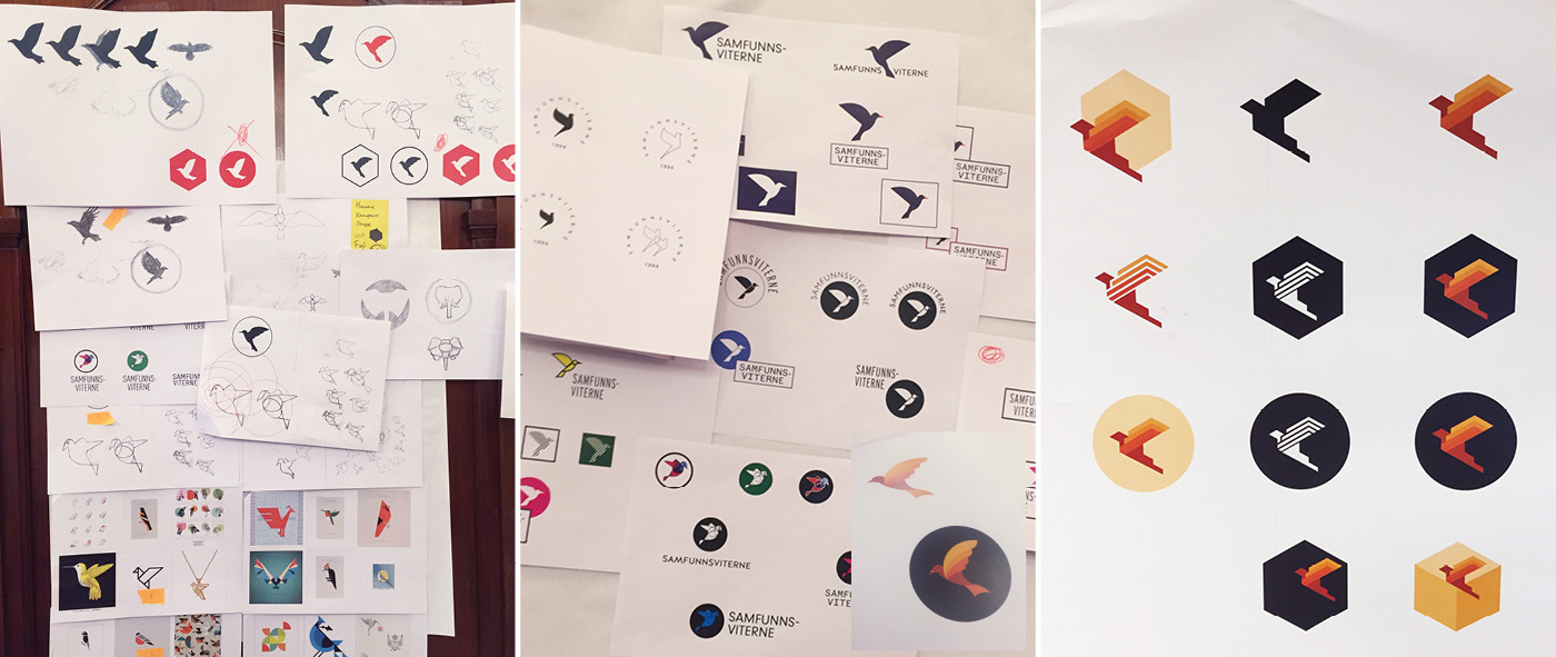
Background and objectives: Samfunnsviterne is an organization that leads the way for its members - they should know that they always have someone to back them up and provide counsel. The organization is a promoter for its members’ salary and work conditions and works actively for raising their salary levels and improving their economic interests and professional expertise. Samfunnsviterne have high ambitions towards 2019, including an increase in (the number of) members. The new profile should express the new direction in which the organization has planned on going and showcase a more specialized and up-to-date organization with great ambitions for growth and impact. The need to be perceived as a leading and dynamic organization provided both constraints and opportunities for the development of a new logo and new visual aids. Solution: The new logo design corresponds with Samfunnsviterne’s objectives, values and characteristics and represents ascent and progress. Samfunnsviterne always lead the way for its members - they are their guide. The symbol in the new logo, also called The Guide, represents this position and the role they have assumed. It has an upward motion that represents the organization’s ambitions for growth and impact on employment and community development, and it symbolizes leadership, overview and perspective. The logo is proud and energetic and the positive attitude displays the position the organization and its representatives should have both locally and centrally. The typography in the signature gives the impression of a more updated organization. The request for the relatively long name to be positioned on one line rather than two, which was the case before, also influenced the design. The result is a visibly strong and readable logo. The bright color palette also contributes to Samfunnsviterne now standing out amongst a vast number of organizations when it comes to both logo and communication platforms.
