Gullblyanten Award identity
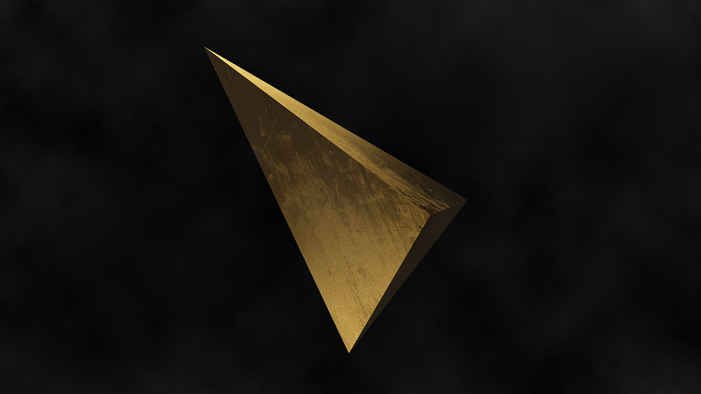
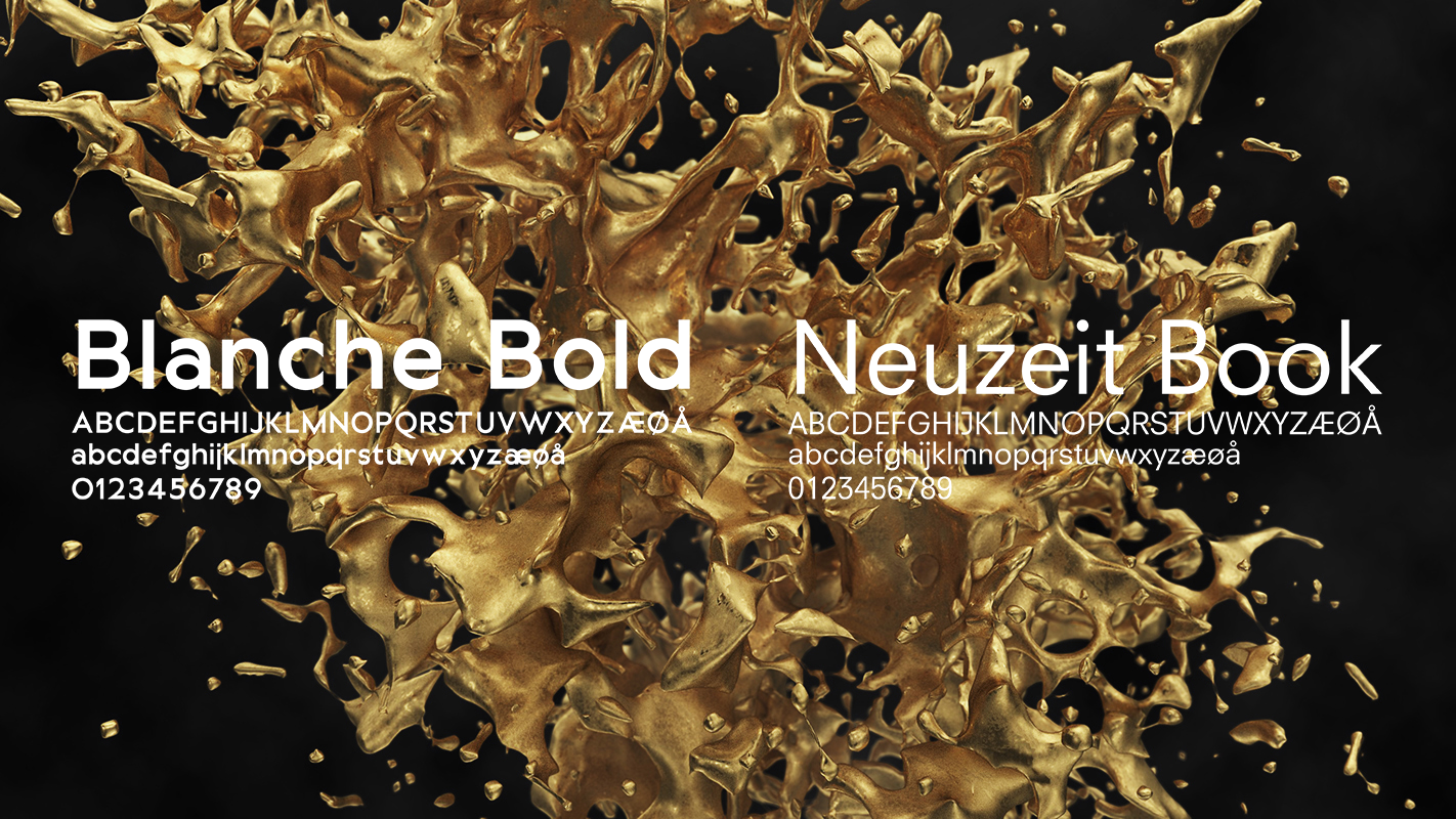
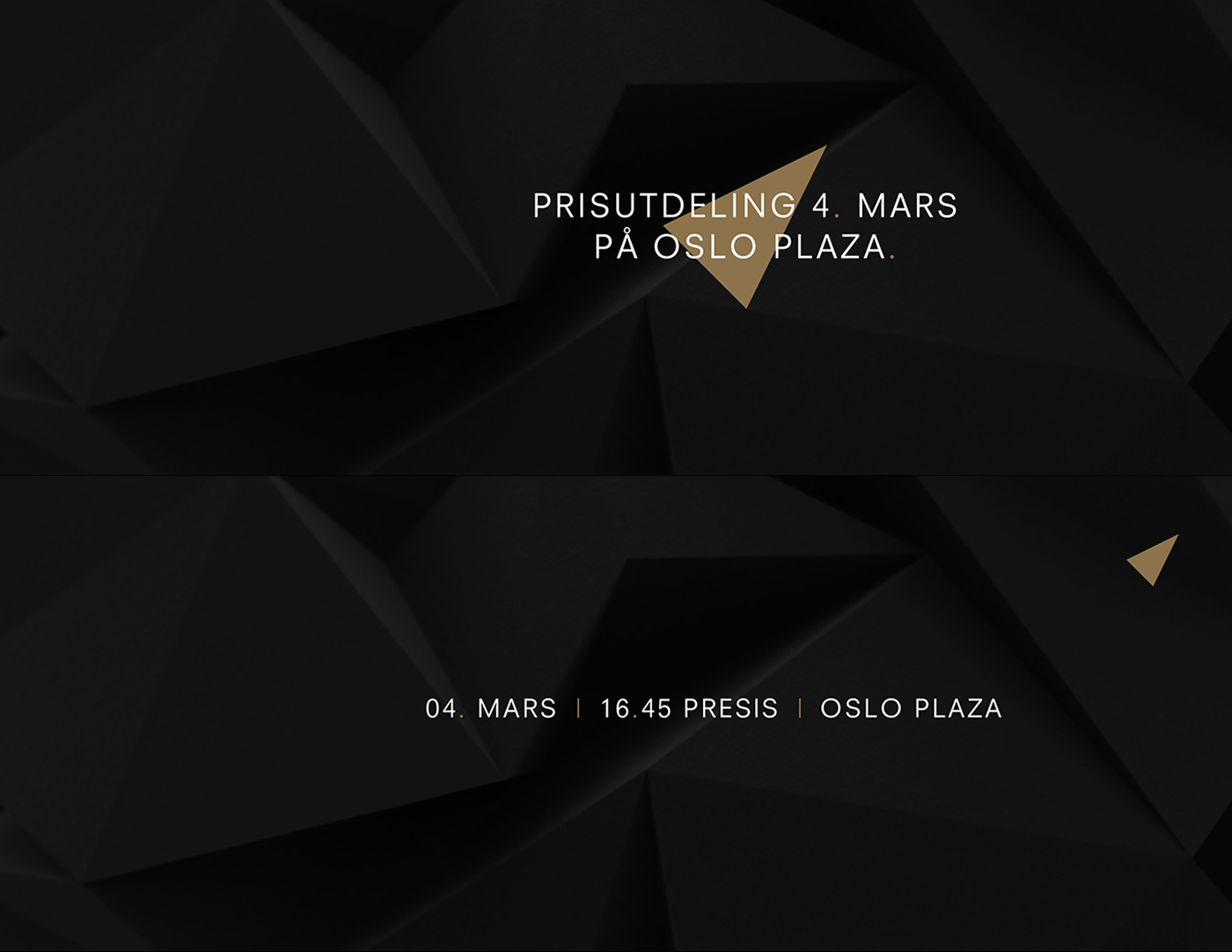
Gullblyanten is a Norwegian award celebrating good ideas and creative commercial communication. It's hosted by Kreativt Forum, and it is the oldest creative award in Norway, with it's first show in 1960. The name translates to 'The Golden Pencil'. This year, we were given the opportunity to redesign their identity. They asked for modern, but classic, distinct and recognizable. The award statuette is shaped as a golden pencil, and over the years this has become a well established symbol in the industry. We chose to incorporate this in the identity, both as a symbol on the diplomas and in the logo. We were also inspired by it's sharpness, and brought this into the typography. Void made the motion graphics used in the vignettes introducing each category. These can be replaced each year, depending on the theme.


